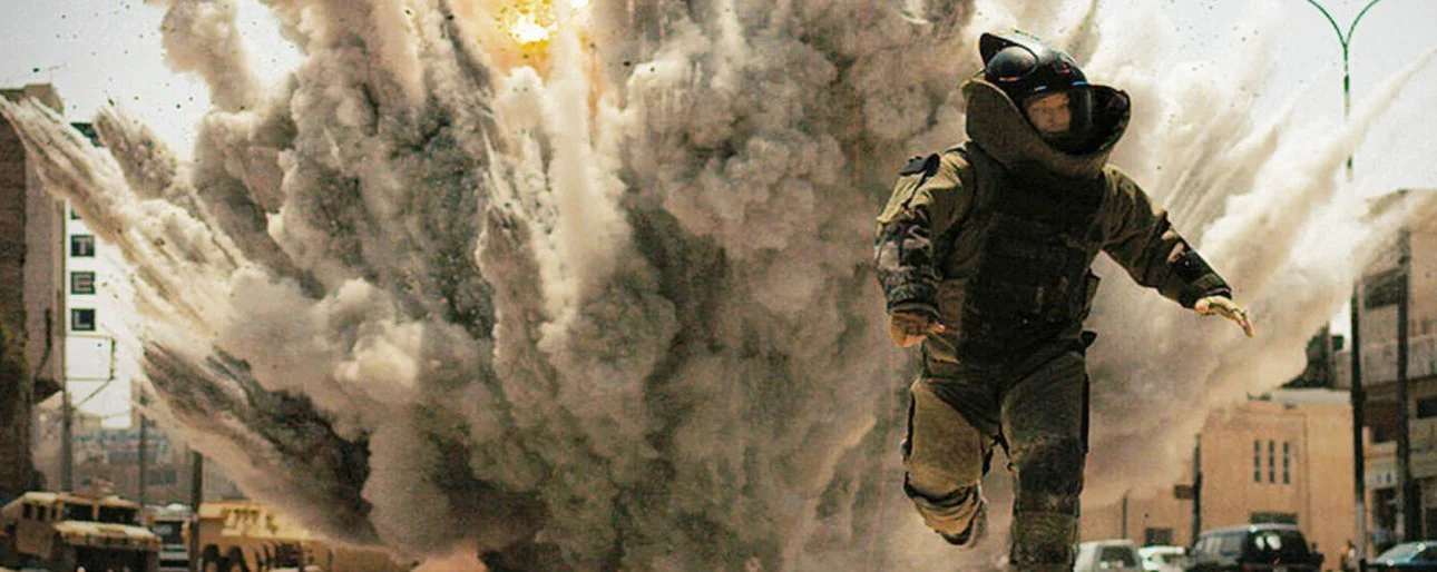
Roger Deakins. A legendary cinematographer that has NEVER won an Oscar, despite being nominated 12 times. Absurd. Blasphemous. He's eyeing a 13th nomination with Sicario, a visceral and intense movie from Quebecois director Denis Villeneuve. A lot of the film’s brilliance has to do with the cinematography that Roger Deakins brings to the table. This is Deakins’ second collaboration with Villeneuve – they make a great duo – and the film is almost as much a showcase for Villeneueve as it is for the famed cinematographer. Villeneuve seems to be giving carte blanche to Deakins with every movie, which isn’t a bad idea, and the two complement each other to great degrees. Villeneuve told me earlier this year “I always profoundly felt Roger wanted to make the movie. One thing I adore about Roger is his discipline and his rigor. He exudes so much respect from the cast and crew. When I started editing the movie I was just floored by what he had done."
"The Wallpapered Hallway" Barton Fink, 1991

Barton Fink, a hypnotic satire on Hollywood, had Deakins working with the Coens for the first time. It builds up a world of dread which converses with every wallpapered hallway and tiny room. The above shot is just one of many hallway scenes that takes your breath away. Deakins focuses a lot of his time on the hallway to build up every claustrophobic minute and takes us into the psyche and feel of John Turturro's Hollywood scribe. Time will never erase the image of a hell-sent John Goodman unleashing fiery hell and brimstone around the flame drenched hallway.
"The hallway shots were really tricky to do," said Deakins, principally because the corridor had to go up in flames during the production. "We built the hallway in Long Beach somewhere, and we basically built two, because we were going to burn one! That one was rigged with gas, recessed in the walls, and all the wallpaper was perforated so the gas would come through it. It was quite interesting, and it worked really well, actually." Deakins to Vulture
"The Chalkboard Equation" A Serious Man, 2009
This underrated Coen's masterpiece is their oddly affecting take on the story of Job. The whole movie is an equation, encompassing a man's misery and journey in figuring out exactly why he has been cursed by such terrible luck and sorrow. The equation is of course too otherworldly to figure out, if it even exists, as shown by this striking frame in which Larry -the guilt-ridden Minnesota professor- tries to find the meaning of life through a never ending equation. The whole point is that there is no point and this striking image has even more impact once you figure that out for yourself.
"There was a tweenie bouncing off unbleached muslin for the first shot. The second shot is lit by the practical and some softened HMI window light and the third shot is also lit by HMI window light. For both I was using 4K HMIs projected through light grid diffusion and I may have had a 1/4 grid to double diffuse the light as well. That I can't remember. There was no space for a balloon in that lecture hall. We taped white cloth to the ceiling and, using existing par lights for fixings, we bounced Red Heads off the ceiling. It could well have been Nook lights but the same idea. I rarely use balloons. The class rooms were lit with white florescent lights that we rigged for the purpose. There was a little bounce coming through the windows, which was slightly cooler than the florescent lights. I believe I also had a couple of 800 Joker HMIs bouncing off the ceiling in the corner of the room behind the camera." Roger Deakins
"The Great Escape" O Brother Where Art Thou?, 2000
O Brother, Where Art Thou? -another Coens collaboration- is a visually aesthetic film that was heavily edited and altered in post-production using digital technology. In fact it's one of the very first films to have ever gone through that process. It has a beautiful, rustic style that was developed after the footage was shot on film and then transferred to digital (and then re-transferred back to film). The result is an orgy of beautiful colors that pop off the screen and welcome us into the 21st century through the eyes of 3 jail broken, outrageous convicts in the 1930's deep south.
"We were shooting in Mississippi in mid-summer and the Coens and I wanted a dry, dusty look but obviously, it was a very lush environment. We also wanted a kind of feeling of a painted postcard, and we experimented for quite a long time. Digital finishing was starting, people had been using digital technology to do effects work and we thought, "Why not try and do the whole film like that?" We made some tests and figured that by the time we finished shooting and were in post-production that the technology would be advanced enough that we could do it. It was a bit of a struggle, but that's what we did." Thompson on Hollywood
"The Interrogation" The Man Who Wasn't There, 2001
When Roger Deakins shoots in Black and White you know it's going to be a total and utter visual feast. The Man Who Wasn't there is an underrated beauty from the Coens and encompasses every single, possible film noir trope, but twists it around and becomes a stamped on Coen-esque visionary nightmare. Deakins uses the overtly stylish surroundings to sheer perfection using every possible smoke-filmed frame to recall the good old days when Black and White photography in Hollywood films was an art in itself. Back in those times cinematographers tried to one up each other with the was they could use black and white. Deakins proves he could have held his own if he working at that time.
"We shot the Barber's shop on the backlot at Paramount. I had a truss above the door outside the set and bounced a row of lights on this truss onto reflectors held back 15 or 20 feet from the window. It wasn’t so much the photographic look of the film they were relating to than it was the sense of the small California town and the atmosphere of the town" Roger Deakins
"We talked about it and it was like – it wasn't 'doing noir.' We wanted to do a modern film but it just happened to be this. We weren't trying to copy a film noir or anything. If it looks film noir it's just because I was playing with the lighting and what felt right at that moment. But for 'The Man Who Wasn't There,' I didn't have references or anything. It was nothing like saying, 'Oh, I'm going to do this kind of scene that we saw in 'Citizen Kane' or 'Sunset Boulevard.' It wasn't about that. I just approached it in the way I would any film, thinking, 'What should this scene feel like,' you know?" Hitfix, Incontention
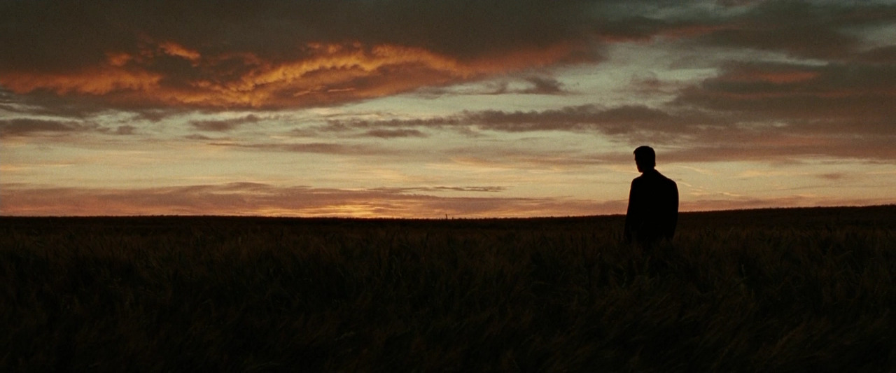
"Sunset" The Assassination of Jesse James by the Coward Robert Ford, 2007
This lost classic from 2007 is one of the last features Deakins shot on film, ever since then he has made the full transition to digital film. It's hard to pick just one image from Andrew Dominik's masterpiece as it is one of the most beautifully photographed movies of the 21st century, the train station shadow/smoke scene is one other iconic moment that comes to mind, but for my money nothing beats this gorgeous frame in which Brad Pitt's Jesse James look over the sunset as he contemplates his next move. It's an eerie, evocative shot that once again shows just how great Deakins can shoot the first sunrise of the day (cue Sicario for another great moment of the sunset)
"I couldn't actually do what I wanted to do photochemically,. "I know some movies look digital but it's kind of the way they're shot and the technology and processing that's being used on them. But I don't think the average person would notice it ... and it just had a better sense of the changing times and the idea that this world was dying," he says. "And in a way, that's what Jesse James knew. It was a much more kind of reflective and thoughtful" Hitfix, Incontention
"Eve and WALL-E" WALL-E, 2008
"The real world, the natural world that we live in just isn't as well-lit as your typical animated world is. There are shadows here. Areas in half-light over there. And if you can take that into account as you're planning your camera movements on a CG production, make those sorts of necessary adjustments to light levels as you're composing your shots, you'll then wind up with scenes that look much more naturalistic when they're up there on the big screen." And while Deakins is quick to play down whatever small role he played in WALL•E's eventual enormous box office success "Seriously. I only consulted on a few shots for the first 20 minutes of that film," Huffington Post
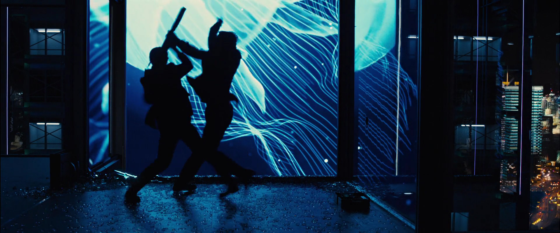
"The Japanese Jellyfish" Skyfall, 2012
Skyfall is by far the best shot Bond film. Its images simmer and make the film such a cinematic, enticing treat to behold. No wonder many have called Skyfall the greatest of James Bond movies. Send Deakins to shoot a movie in Japan and you'll end up with one hell of a finished prodyuct. The imagery that stuck with me the most was that of the Shanghai office interior where James Bond intercepts Patrice, a hired assassin that ruthlessly goes after 007. Their fight, shot in a silhouette with a distinctive neon blue signage, features a prominent jellyfish floating in the background
"We were coming out of the monochromatic gray of England, so we wanted to arrive in Shanghai with a bang—a lot of color and movement of light. Gradually we came to the idea of making everything glass, so the whole thing was this big box of magical reflections. We built a model to see how the reflections would work and so we could position the big billboards and have the assassin firing at the hotel room in the right position. Then we built the set on the soundstage and spent a number of weeks rigging it, positioning every light. The jellyfish originally were just a stand-in image, but it was such a good choice, it stayed. We needed images for the monitor, and the art department found this footage of jellyfish floating through the frame,”
“When it came time to discuss what we really wanted to put on those screens, Sam and I looked at each other and said, ‘Well, why don’t we just leave it as jellyfish?’ It looked interesting, and it was a really deep blue, and we wanted this whole Shanghai section to feel quite cold. So that’s how the jellyfish got in the film — they were just stand-ins, really!” Shot Significance: “The calming, poetic nature of the jellyfish imagery builds the tension of the scene. If the imagery had been frenetic, like what you usually see on billboards, we wouldn’t have been able to build that sort of menace. And that’s what we were after: the ultimate cat-and-mouse scene.” Roger Deakins
"Freedom" The Shawshank Redemption, 1994
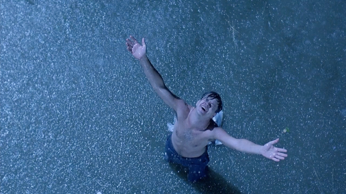
Deakins earned his first Oscar nomination for shooting The Shawshank Redemption. A film which started off as a decently reviewed prison drama and has turned into a stone cold classic. That famous shot of Andy escaping from the prison, arms outstretched as the rain pours down on him? You know, the moment so powerful that it was repurposed on the poster? Yeah, that wasn't originally part of the plan. Or at least what Deakins says,
"It was a difficult schedule on that film, and we had quite a lot of night work scheduled for when Tim's character escapes from the jail: He was going to run across the length of the field and catch a train that was going by the prison," "There was a lot of stuff planned, and schedule-wise, we just couldn't do that. So this shot, with Andy standing there in the rain, had to be this iconic shot that signified the end of the sequence ... because we couldn't afford to shoot the rest of it, basically!" The film came out in 1994, the same year another Tim Robbins–toplined, Deakins-shot movie with a funny name debuted. "One of my neighbors came up to me the other day and said, 'You know, I really like Shawshank, but one of my favorite films is The Hudsucker Proxy!'" laughed Deakins, who noted another similarity between the Coen brothers comedy and Shawshank: "When The Hudsucker Proxy came out, hardly anybody saw it. It was quite a blow for the boys and me, because we'd put so much into that film, and I thought it was really good! But when Shawshank was released, too, it made nothing theatrically; then, when it had a video release, suddenly it was on the charts for a year. It's all very odd." Roger Deakins
"Night to Dawn" No Country For Old Men, 2007
This bravura No Country scene, which goes from night to dawn as Josh Brolin is pursued by criminals, has an incredible use of light throughout, add in one very ardent pit bull and you've got a night of terror for our hero. In order to capture the dawn shots, Deakins shot some in the morning and some at magic hour, though he confessed that he can't tell which came when.
"I think that was one of the most difficult sequences I've ever done, really, I'm not 100 percent happy with it, but I'm not 100 percent happy with anything, really. It was really hard to do, given our budget and schedule." We were filming in New Mexico, and the weather is so different in the mornings and the evenings. Nobody really notices it, but it's obvious to me that the clouds build up during the day and you've got a lot of them in the evening shots, while the morning shots are crystal clear. There are quite a few of those mismatches." Roger Deakins
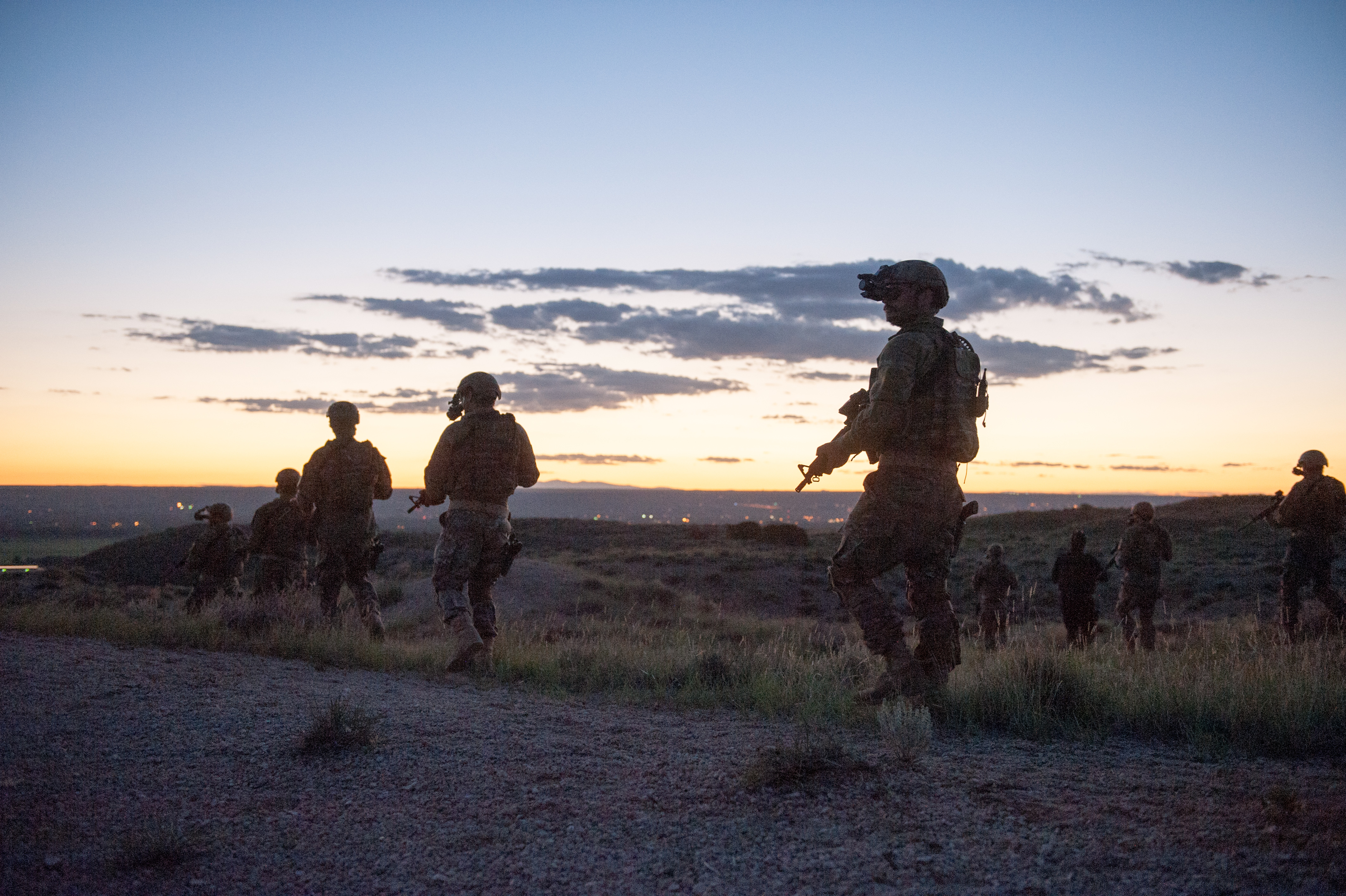
"Ready for War" Sicario, 2015
It seems like Deakins has taken a real liking to Quebecois director Denis Villeneuve. They collaborated together on Prisoners, Sicario and the upcoming Blade Runner sequel. Sicario is as much Deakins' film as it is Villeneuve's. Following FBI agent Emily Blunt, the film has Deakins returning to the similar landscapes and as those from “No Country For Old Men". These are clean, saturated colors and might just be Deakins' best digital work to date. The shots of a danger-filled Mexico City and tempty, isolated deserts brings out the best in Deakins' talent. However, we can't ever shake off the finale in which Villeneuve and Deakins follow their soldiers into the field of battle as the sunset looms over their silhouetted bodies.
"You always run tests for something, but we didn’t do that many tests on Sicario. It was mainly testing the night vision system and the FLIR (thermal imaging) camera, but there weren’t too many other things we tested. I rarely work with more than one camera. Even on Skyfall, it was mostly a one-camera show. It’s a different approach to filmmaking. [Sicario director Denis Villeneuve] is quite decisive about what shot he wants tobe on for what part of the action. So it’s not a matter of getting a load of cameras out and just getting coverage. To me, that’s not filmmaking. Denis has a very precise way of approaching things. He likes working single camera and so do I." Roger Deakins
"One of the most notable influences on our choices of camera placement, framing and lighting was the style of Jean-Pierre Melville. He’s able to attain a sort of simple yet stylish realism… we tried to stick with that spirit in filming Sicario, with an economy of means that in English we refer to with the expression ‘less is more" IndieWire

